Seasonal data analysis in Python involves examining available data of past sales in an effort to draw a forecast of what future sales are likely to be, this can be vital for many reasons such as knowing how much inventory to have on hand as well as arranging marketing activities around this. The methods in this article can be used to examine a variety of different seasonal data so the intention of this series is to examine the various steps that can be taken to fine-tune the accuracy of the forecast model. Part 1 will be fun on the data set with no true tuning and in future articles we will look at segmenting the data by region and/or vehicle type to see how this affects the accuracy of the forecast as well as trialling limiting the time periods to eliminate anomalous data. In Part 2 we examine the effect of segmentation on the accuracy of the forecast.
We will be examining new car sales in Australia, utilising the data provided by the Australian Bureau of Statistics; this report is provided every year and details the sales for each calendar year since 1994. To test the most accurate method of running a forecast we will be passing various sets of data through the pylab library. My chosen environment is Jupyter Notebooks but there are several available.
First we need to import the libraries that we are going to use during this examination;
import warnings
import itertools
import numpy as np
import matplotlib.pyplot as plt
warnings.filterwarnings("ignore")
plt.style.use('fivethirtyeight')
imdport pandas as pd
import statsmodels.api as sm
import matplotlib
from pylab import rcParams
matplotlib.rcParams['axes.labelsize'] = 14
matplotlib.rcParams['xtick.labelsize'] = 12
matplotlib.rcParams['text.color'] = 'k'
Then we we are going to import the Excel file from the Australian Bureau of Statistics and have a look at the head of it to see what kind of data we are dealing with;
df = pd.read_excel("NEWMVSALES.xls")
print(df.head(5))
MEASURE Measure VEHICLE Vehicle Type ASGS_2011 Region \
0 1 Number 100 Passenger vehicles 1 New South Wales
1 1 Number 100 Passenger vehicles 1 New South Wales
2 1 Number 100 Passenger vehicles 1 New South Wales
3 1 Number 100 Passenger vehicles 1 New South Wales
4 1 Number 100 Passenger vehicles 1 New South Wales
TSEST Adjustment Type FREQUENCY Frequency TIME Time Value \
0 20 Seasonally Adjusted M Monthly 1994-01 Jan-1994 13107.8
1 20 Seasonally Adjusted M Monthly 1994-02 Feb-1994 13710.6
2 20 Seasonally Adjusted M Monthly 1994-03 Mar-1994 13562.4
3 20 Seasonally Adjusted M Monthly 1994-04 Apr-1994 13786.9
4 20 Seasonally Adjusted M Monthly 1994-05 May-1994 13871.1
Flag Codes Flags
0 NaN NaN
1 NaN NaN
2 NaN NaN
3 NaN NaN
4 NaN NaN We can see there are several classification parameters such as Vehicle Type, Region, Adjustment Type, and Frequency but first, we will get a sense of the shape of the other data.
df.describe()MEASURE VEHICLE ASGS_2011 TSEST Value Flag Codes
count 31104.0 31104.000000 31104.00000 31104.000000 31104.000000 0.0
mean 1.0 425.000000 4.00000 20.000000 8623.252701 NaN
std 0.0 311.252493 2.58203 8.165097 15316.647740 NaN
min 1.0 100.000000 0.00000 10.000000 30.000000 NaN
25% 1.0 175.000000 2.00000 10.000000 761.925000 NaN
50% 1.0 350.000000 4.00000 20.000000 2903.100000 NaN
75% 1.0 600.000000 6.00000 30.000000 9714.325000 NaN
max 1.0 900.000000 8.00000 30.000000 134171.000000 NaN| MEASURE | VEHICLE | ASGS_2011 | TSEST | Value | Flag Codes | |
| count | 31104.0 | 31104.000000 | 31104.00000 | 31104.000000 | 31104.000000 | 0.0 |
| mean | 1.0 | 425.000000 | 4.00000 | 20.000000 | 8623.252701 | NaN |
| std | 0.0 | 311.252493 | 2.58203 | 8.165097 | 15316.647740 | NaN |
| min | 1.0 | 100.000000 | 0.00000 | 10.000000 | 30.000000 | NaN |
| 25% | 1.0 | 175.000000 | 2.00000 | 10.000000 | 761.925000 | NaN |
| 50% | 1.0 | 350.000000 | 4.00000 | 20.000000 | 2903.100000 | NaN |
| 75% | 1.0 | 600.000000 | 6.00000 | 30.000000 | 9714.325000 | NaN |
| max | 1.0 | 900.000000 | 8.00000 | 30.000000 | 134171.000000 | NaN |
Given that Flag Codes and Flag contain only empty cells we can disregard them. Measure and Vehicle columns are doubled up utilising both numbers as a classification, the above output of Measure shows that the entire data set has the same classification so we can disregard this column also, for ease of readability we will use the non-numeric Vehicle Type instead of the numeric classification; the only numerical columns that we will be interested in is the Value column.
Let’s get a full list of columns then examine and have a look at the unique values in each of the classification columns to see what we want to use for our first model.
print(df.columns)Index(['MEASURE', 'Measure', 'VEHICLE', 'Vehicle Type', 'ASGS_2011', 'Region',
'TSEST', 'Adjustment Type', 'FREQUENCY', 'Frequency', 'TIME', 'Time',
'Value', 'Flag Codes', 'Flags'],
dtype='object')print("Vehicle type values are: " + str(df['Vehicle Type'].unique())+"\n")
print("Region values are: " + str(df['Region'].unique())+"\n")
print("Adjustment Type values are: " + str(df['Adjustment Type'].unique())+"\n")Vehicle type values are: ['Passenger vehicles' 'Other vehicles' 'Sports utility vehicles'
'Total Vehicles']
Region values are: ['New South Wales' 'South Australia' 'Western Australia' 'Tasmania'
'Victoria' 'Australian Capital Territory' 'Northern Territory'
'Australia' 'Queensland']
Adjustment Type values are: ['Seasonally Adjusted' 'Original' 'Trend']#set the desired data filters
all_cars = df.loc[df['Vehicle Type'] == 'Total Vehicles']
all_cars = all_cars.loc[all_cars['Adjustment Type'] == 'Original']
#all_cars_all_region['TIME'] = pd.to_datetime(all_cars['TIME'])
all_cars_all_region = all_cars.loc[all_cars['Region'] == 'Australia']
#select the colums that we want to examine, we'll keep Region to be able to use in future examinations
cols = 'TIME', 'Value', 'Region'
all_cars_all_region = pd.DataFrame(all_cars_all_region, columns = cols)
#convert the 'TIME' column to a datetime values
all_cars_all_region['TIME'] = pd.to_datetime(all_cars_all_region['TIME'])
#sort the values by date
all_cars_all_region.sort_values('TIME')
#check for any empty cells within our new data set
all_cars_all_region.isnull().sum()TIME 0<br>Value 0<br>Region 0<br>dtype: int64Let’s check what the time frame of the data is.
all_cars_all_region['TIME'].min(), all_cars_all_region['TIME'].max()(Timestamp('1994-01-01 00:00:00'), Timestamp('2017-12-01 00:00:00'))Finally, the last preparation step; index the time perimeter
all_cars_all_region = all_cars_all_region.set_index('TIME')
all_cars_all_region.indexDatetimeIndex(['1994-01-01', '1994-02-01', '1994-03-01', '1994-04-01',
'1994-05-01', '1994-06-01', '1994-07-01', '1994-08-01',
'1994-09-01', '1994-10-01',
...
'2017-03-01', '2017-04-01', '2017-05-01', '2017-06-01',
'2017-07-01', '2017-08-01', '2017-09-01', '2017-10-01',
'2017-11-01', '2017-12-01'],
dtype='datetime64[ns]', name='TIME', length=288, freq=None)Let’s check the result.
all_cars_all_region.head(10)| Value | Region | |
| TIME | ||
| 1994-01-01 | 35596.0 | Australia |
| 1994-02-01 | 47131.0 | Australia |
| 1994-03-01 | 56816.0 | Australia |
| 1994-04-01 | 43243.0 | Australia |
| 1994-05-01 | 52678.0 | Australia |
| 1994-06-01 | 64189.0 | Australia |
| 1994-07-01 | 48580.0 | Australia |
| 1994-08-01 | 52627.0 | Australia |
| 1994-09-01 | 52040.0 | Australia |
| 1994-10-01 | 52722.0 | Australia |
Excellent, everything looks ready. Let’s have a look at a graph of the data to get an idea of trends that have been experienced over the past 14 years.
y = all_cars_all_region['Value']

y.plot(figsize=(20, 15),x = None)
plt.show()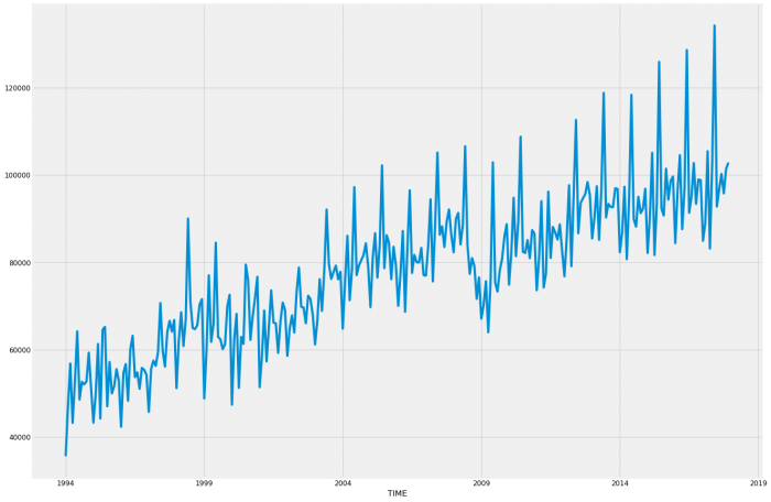
By this, we can see that it follows a similar pattern every year with relatively consistent growth except for 2008 and 2009 which matches up with the Global Financial Crisis. We will note that for later as it might impact our model, we may get better results by reducing the time period after this. For now, we will proceed with the entire data set.
Let’s take a look at the sales pattern by looking at 3 years more closely;
z = all_cars_all_region['2015-01':'2017-12']

z.plot(figsize = (20,15),x = None)
plt.show()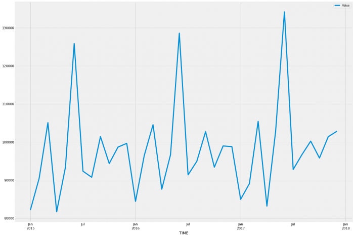
So it looks like March, June, September, and December are the peak months; January, April, July, and August are all low sales months, likely due to the heavy sales the month before.
Let’s run our ARIMA model
#12 seasons chosen per year due to the clear pattern of 12 distinctly different monthly patterns.
p = d = q = range(0, 2)
pdq = list(itertools.product(p, d, q))
seasonal_pdq = [(x[0], x[1], x[2], 12) for x in list(itertools.product(p, d, q))]

print('Examples of parameter combinations for Seasonal ARIMA...')
print('SARIMAX: {} x {}'.format(pdq[1], seasonal_pdq[1]))
print('SARIMAX: {} x {}'.format(pdq[1], seasonal_pdq[2]))
print('SARIMAX: {} x {}'.format(pdq[2], seasonal_pdq[3]))
print('SARIMAX: {} x {}'.format(pdq[2], seasonal_pdq[4]))
#Examples of parameter combinations for Seasonal ARIMA... SARIMAX: (0, 0, 1) x (0, 0, 1, 12)
SARIMAX: (0, 0, 1) x (0, 1, 0, 12)
SARIMAX: (0, 1, 0) x (0, 1, 1, 12)
SARIMAX: (0, 1, 0) x (1, 0, 0, 12)#initialise list to be able to hold results to make it easier to find the lowest result to find which model to use quicker
results_list = []
for param in pdq:
for param_seasonal in seasonal_pdq:
try:
mod = sm.tsa.statespace.SARIMAX(y,
order=param,
seasonal_order=param_seasonal,
enforce_stationarity=False,
enforce_invertibility=False)
results = mod.fit()
warnings.filterwarnings("ignore")
results_list.append(results.aic)
print('ARIMA{}x{}12 - AIC:{}'.format(param, param_seasonal, results.aic))
except:
continue
print("lowest result is " + str(min(results_list)))ARIMA(0, 0, 0)x(0, 0, 0, 12)12 - AIC:7293.293369312979
ARIMA(0, 0, 0)x(0, 0, 1, 12)12 - AIC:6815.078143900661
ARIMA(0, 0, 0)x(0, 1, 0, 12)12 - AIC:5643.460985883648
ARIMA(0, 0, 0)x(0, 1, 1, 12)12 - AIC:5393.229683485892
ARIMA(0, 0, 0)x(1, 0, 0, 12)12 - AIC:5648.249615304498
ARIMA(0, 0, 0)x(1, 0, 1, 12)12 - AIC:5619.83710706473
ARIMA(0, 0, 0)x(1, 1, 0, 12)12 - AIC:5408.357711483104
ARIMA(0, 0, 0)x(1, 1, 1, 12)12 - AIC:5390.889959479369
ARIMA(0, 0, 1)x(0, 0, 0, 12)12 - AIC:7070.676989709407
ARIMA(0, 0, 1)x(0, 0, 1, 12)12 - AIC:6722.307461993595
ARIMA(0, 0, 1)x(0, 1, 0, 12)12 - AIC:5549.687148257799
ARIMA(0, 0, 1)x(0, 1, 1, 12)12 - AIC:5298.961945427468
ARIMA(0, 0, 1)x(1, 0, 0, 12)12 - AIC:6744.487690038421
ARIMA(0, 0, 1)x(1, 0, 1, 12)12 - AIC:6697.5946667617645
ARIMA(0, 0, 1)x(1, 1, 0, 12)12 - AIC:5340.107258081442
ARIMA(0, 0, 1)x(1, 1, 1, 12)12 - AIC:5300.355784227131
ARIMA(0, 1, 0)x(0, 0, 0, 12)12 - AIC:6180.9815862504765
ARIMA(0, 1, 0)x(0, 0, 1, 12)12 - AIC:5792.313461934212
ARIMA(0, 1, 0)x(0, 1, 0, 12)12 - AIC:5557.459124697066
ARIMA(0, 1, 0)x(0, 1, 1, 12)12 - AIC:5274.329959463097
ARIMA(0, 1, 0)x(1, 0, 0, 12)12 - AIC:5569.411464272851
ARIMA(0, 1, 0)x(1, 0, 1, 12)12 - AIC:5530.843450980574
ARIMA(0, 1, 0)x(1, 1, 0, 12)12 - AIC:5320.65575631255
ARIMA(0, 1, 0)x(1, 1, 1, 12)12 - AIC:5269.395081982428
ARIMA(0, 1, 1)x(0, 0, 0, 12)12 - AIC:6019.6445211383925
ARIMA(0, 1, 1)x(0, 0, 1, 12)12 - AIC:5691.054277950849
ARIMA(0, 1, 1)x(0, 1, 0, 12)12 - AIC:5468.475109996415
ARIMA(0, 1, 1)x(0, 1, 1, 12)12 - AIC:5179.1192748126205
ARIMA(0, 1, 1)x(1, 0, 0, 12)12 - AIC:5680.107572974952
ARIMA(0, 1, 1)x(1, 0, 1, 12)12 - AIC:5630.9405249553
ARIMA(0, 1, 1)x(1, 1, 0, 12)12 - AIC:5244.363316874456
ARIMA(0, 1, 1)x(1, 1, 1, 12)12 - AIC:5180.138355280625
ARIMA(1, 0, 0)x(0, 0, 0, 12)12 - AIC:6203.566418467412
ARIMA(1, 0, 0)x(0, 0, 1, 12)12 - AIC:5811.533567784873
ARIMA(1, 0, 0)x(0, 1, 0, 12)12 - AIC:5518.562759701984
ARIMA(1, 0, 0)x(0, 1, 1, 12)12 - AIC:5259.482683831171
ARIMA(1, 0, 0)x(1, 0, 0, 12)12 - AIC:5729.444733708864
ARIMA(1, 0, 0)x(1, 0, 1, 12)12 - AIC:5728.438134961931
ARIMA(1, 0, 0)x(1, 1, 0, 12)12 - AIC:5266.757771472065
ARIMA(1, 0, 0)x(1, 1, 1, 12)12 - AIC:5260.778758614272
ARIMA(1, 0, 1)x(0, 0, 0, 12)12 - AIC:6031.1654983224
ARIMA(1, 0, 1)x(0, 0, 1, 12)12 - AIC:5687.269280606292
ARIMA(1, 0, 1)x(0, 1, 0, 12)12 - AIC:5474.543180061646
ARIMA(1, 0, 1)x(0, 1, 1, 12)12 - AIC:5194.401187991937
ARIMA(1, 0, 1)x(1, 0, 0, 12)12 - AIC:5644.028869095402
ARIMA(1, 0, 1)x(1, 0, 1, 12)12 - AIC:5613.990399110331
ARIMA(1, 0, 1)x(1, 1, 0, 12)12 - AIC:5234.465961382581
ARIMA(1, 0, 1)x(1, 1, 1, 12)12 - AIC:5195.756676672797
ARIMA(1, 1, 0)x(0, 0, 0, 12)12 - AIC:6138.097777417985
ARIMA(1, 1, 0)x(0, 0, 1, 12)12 - AIC:5703.459036074439
ARIMA(1, 1, 0)x(0, 1, 0, 12)12 - AIC:5508.443461569642
ARIMA(1, 1, 0)x(0, 1, 1, 12)12 - AIC:5231.203130757599
ARIMA(1, 1, 0)x(1, 0, 0, 12)12 - AIC:5501.226799583273
ARIMA(1, 1, 0)x(1, 0, 1, 12)12 - AIC:5672.90736671603
ARIMA(1, 1, 0)x(1, 1, 0, 12)12 - AIC:5253.108626290737
ARIMA(1, 1, 0)x(1, 1, 1, 12)12 - AIC:5229.252731741912
ARIMA(1, 1, 1)x(0, 0, 0, 12)12 - AIC:6020.83830843927
ARIMA(1, 1, 1)x(0, 0, 1, 12)12 - AIC:5691.195529597255
ARIMA(1, 1, 1)x(0, 1, 0, 12)12 - AIC:5470.086899925115
ARIMA(1, 1, 1)x(0, 1, 1, 12)12 - AIC:5181.080072613651
ARIMA(1, 1, 1)x(1, 0, 0, 12)12 - AIC:5657.138075950534
ARIMA(1, 1, 1)x(1, 0, 1, 12)12 - AIC:5630.675745612928
ARIMA(1, 1, 1)x(1, 1, 0, 12)12 - AIC:5227.068484061379
ARIMA(1, 1, 1)x(1, 1, 1, 12)12 - AIC:5182.072520325035
lowest result is 5179.1192748126205So our parameters are (0, 1, 1) and (0, 1, 1, 12)
mod = sm.tsa.statespace.SARIMAX(y,
                                order=(0, 1, 1),
                                seasonal_order=(0, 1, 1, 12),
                                enforce_stationarity=False,
                                enforce_invertibility=False)

results = mod.fit()

print(results.summary().tables[1])
==============================================================================
coef std err z P>|z| [0.025 0.975]
------------------------------------------------------------------------------
ma.L1 -0.6213 0.040 -15.501 0.000 -0.700 -0.543
ma.S.L12 -0.5424 0.048 -11.297 0.000 -0.636 -0.448
sigma2 2.939e+07 4.56e-10 6.44e+16 0.000 2.94e+07 2.94e+07
==============================================================================To check how well the model fits we’ll run it alongside known data first in case it needs more fine-tuning.To check how well the model fits we’ll run it alongside known data first in case it needs more fine-tuning.To check how well the model fits we’ll run it alongside known data first in case it needs more fine-tuning.
pred = results.get_prediction(start=pd.to_datetime('2015-01-01'), dynamic=False)

pred_ci = pred.conf_int()

ax = y['2014':].plot(label='observed')
pred.predicted_mean.plot(ax=ax, label='One-step ahead Forecast', alpha=.7, figsize=(30, 20))

ax.fill_between(pred_ci.index,
pred_ci.iloc[:, 0],
pred_ci.iloc[:, 1], color='k', alpha=.2)

ax.set_xlabel('Date')
ax.set_ylabel('Vehicle Sales')
plt.legend()

plt.show()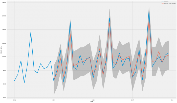
That looks pretty good, the high and low months in particular fit very closely, there is some error in the middle months so let’s see how it compares overall
y_forecasted = pred.predicted_mean
y_truth = y['2015-01':]

mse = ((y_forecasted - y_truth) ** 2).mean()
print('The Mean Squared Error of our forecasts is {}'.format(round(mse, 2)))
print('The Root Mean Squared Error of our forecasts is {}'.format(round(np.sqrt(mse),2)))
The Mean Squared Error of our forecasts is 12947625.33
The Root Mean Squared Error of our forecasts is 3598.28Ok, so approximately 3600 is pretty good when you’re talking 80,000 to 130,000 per month
pred_uc = results.get_forecast(steps = 48)
pred_ci = pred_uc.conf_int()

ax = y.plot(label = 'observed', figsize = (30, 20))
pred_uc.predicted_mean.plot(ax=ax, label='Forecast')
ax.fill_between(pred_ci.index,
pred_ci.iloc[:, 0],
pred_ci.iloc[:, 1], color = 'k', alpha = .25)
ax.set_xlabel('Date')
ax.set_ylabel('Car Sales')

plt.legend()
plt.show()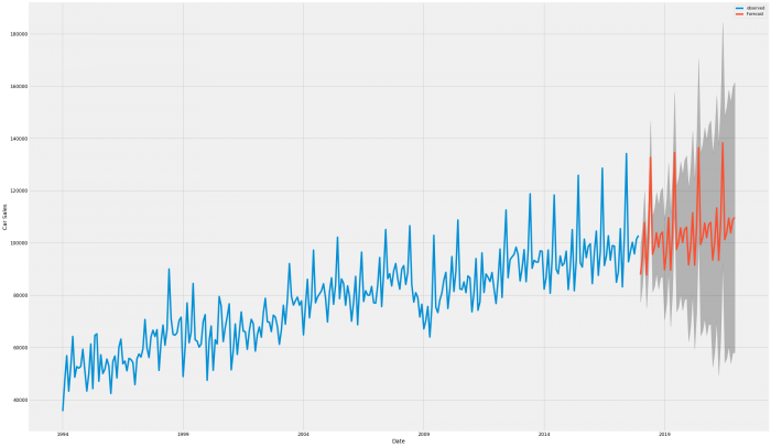
That certainly looks like it continues the pattern of the previous years.
Now while we don’t have access to the detailed data for 2018 to date, we do have access to various third-party reports that discuss the totals, i have compiled this data using Cox Automotive’s monthly report to check our model against
pred_uc2 = results.get_forecast(steps = 10)
prediction = pred_uc2.predicted_mean
prediction.to_csv("2018forecast.xls")
prediction = pd.read_csv("2018forecast.xls", header = None)
prediction.columns = ['Time', 'Value']
print('2018 Prediction \n')
print(prediction)
prediction.to_csv("2018forecast.xls")
print('\n \n')
print('2018 YTD actual data \n')
df2 = pd.read_excel("2018YTD.xls")
print(df2)2018 Prediction
Time Value
0 2018-01-01 87835.521780
1 2018-02-01 94719.598479
2 2018-03-01 107766.389743
3 2018-04-01 87720.943587
4 2018-05-01 102595.203293
5 2018-06-01 132661.717537
6 2018-07-01 95666.385156
7 2018-08-01 98341.484265
8 2018-09-01 103847.180318
9 2018-10-01 98256.828271
2018 YTD actual data
TIME Value
0 2018-01-01 88551
1 2018-02-01 95999
2 2018-03-01 106988
3 2018-04-01 82930
4 2018-05-01 100754
5 2018-06-01 130300
6 2018-07-01 85551
7 2018-08-01 95221
8 2018-09-01 94711
9 2018-10-01 90718That looks pretty good, let’s graph that and get our total variance
prediction = pd.read_csv("/home/paul/Documents/Portfolio/New_vehicle_sales/2018forecast.xls")/
ax = df2['Value'].plot(label = 'actuals', figsize = (30,20), color = 'b')
prediction['Value'].plot(ax = ax, label = 'forecast',color = 'r', alpha = 0.7, figsize = (30, 20))

ax.set_xlabel('Month')
ax.set_ylabel('Car Sales')

plt.legend()
plt.show()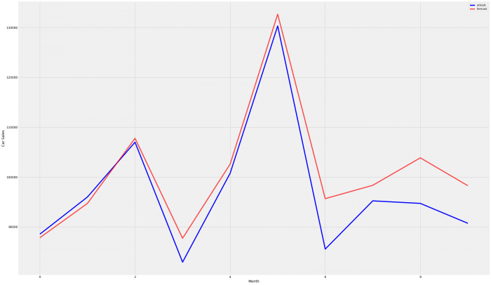
prediction_total = int(prediction['Value'].sum())
actuals_total = round(df2['Value'].sum(), 2)
variance = round(prediction_total - actuals_total, 2)
variance_percentage = round(((prediction_total / actuals_total) - 1) * 100, 2)
print('total prediction YTD for 2018 was ' + str(prediction_total))
print('total actuals YTD for 2018 was ' + str(actuals_total))
print('total variance is ' + str(variance) + ' or ' + str(variance_percentage) + '%')
total prediction YTD for 2018 was 1009411
total actuals YTD for 2018 was 971723
total variance is 37688 or 3.88%So far the forecasted results look to be consistently slightly higher than the actual results, we will examine the cause for this inaccuracy closer to determine if it was car type-based or possibly region-based, or an overall trend change. The final step for this article will be to save the 4 years of forecast data and print it for any further examination.
prediction_4_year = pd.DataFrame(pred_uc.predicted_mean)
prediction_4_year.to_csv("/home/paul/Documents/Portfolio/New_vehicle_sales/4_year_forecast_all.xls")
prediction_4_year = pd.read_csv("/home/paul/Documents/Portfolio/New_vehicle_sales/4_year_forecast_all.xls")
prediction_4_year.columns = ['TIME', 'Value']
print('4 Year Prediction \n')
print(prediction_4_year)
prediction_4_year.to_csv("/home/paul/Documents/Portfolio/New_vehicle_sales/4_year_forecast_all.xls")4 Year Prediction
TIME Value
0 2018-01-01 87835.521780
1 2018-02-01 94719.598479
2 2018-03-01 107766.389743
3 2018-04-01 87720.943587
4 2018-05-01 102595.203293
5 2018-06-01 132661.717537
6 2018-07-01 95666.385156
7 2018-08-01 98341.484265
8 2018-09-01 103847.180318
9 2018-10-01 98256.828271
10 2018-11-01 103181.269135
11 2018-12-01 104130.896814
12 2019-01-01 89698.643506
13 2019-02-01 96582.720205
14 2019-03-01 109629.511469
15 2019-04-01 89584.065313
16 2019-05-01 104458.325018
17 2019-06-01 134524.839263
18 2019-07-01 97529.506882
19 2019-08-01 100204.605991
20 2019-09-01 105710.302044
21 2019-10-01 100119.949997
22 2019-11-01 105044.390861
23 2019-12-01 105994.018540
24 2020-01-01 91561.765232
25 2020-02-01 98445.841931
26 2020-03-01 111492.633195
27 2020-04-01 91447.187039
28 2020-05-01 106321.446744
29 2020-06-01 136387.960989
30 2020-07-01 99392.628608
31 2020-08-01 102067.727717
32 2020-09-01 107573.423770
33 2020-10-01 101983.071723
34 2020-11-01 106907.512587
35 2020-12-01 107857.140266
36 2021-01-01 93424.886958
37 2021-02-01 100308.963657
38 2021-03-01 113355.754921
39 2021-04-01 93310.308765
40 2021-05-01 108184.568470
41 2021-06-01 138251.082715
42 2021-07-01 101255.750334
43 2021-08-01 103930.849443
44 2021-09-01 109436.545496
45 2021-10-01 103846.193449
46 2021-11-01 108770.634313
47 2021-12-01 109720.261992For a first forecast with no refinement, 3.88% is pretty good, I’m sure we can get better with some more refinement of the segmentation and dates which we will do in Part 2 of this blog.
If you are interested in the source code see my GitHub.
Leave a Reply